
Brand Resources and Guidelines
Everything You Need to Represent Canidium
Find our approved logos, colors, and typography in one place, along with guidance on using them well. Whether you're on the Canidium team, working with us as a partner, or writing about us, these guidelines help keep our brand clear and consistent wherever it appears.
Logos
Horizontal logo
Icon beside the wordmark. Our primary logo and the default choice for websites, documents, email, and partner materials.

Stacked logo
Icon above the wordmark. Best for square or vertical spaces like social avatars, event signage, and title slides.
Icon
The avocado on its own. Use it where the wordmark appears nearby or space is limited, like favicons, app icons, and profile images.

Clear Space and Sizing
Shown at actual size

Our logo needs room to work. Keep text, graphics, photos, and other logos outside the clear space zone so nothing competes with the mark or appears to be part of it. Scaling it too small causes problems of its own, since the wordmark and icon start to lose detail, so always stay at or above the minimum sizes below. Select any spec to see it in action, with sizing examples shown at actual size.
Dos
-
Do: Use the full color logo on light backgrounds -
Do: Use the reversed logo on brand blues -
Do: Use the monochrome logo when color isn't available -
Do: Place the logo on photos only with a calm area or overlay -
Do: Resize proportionally -

Do: Use the official files provided on this webpage
Don'ts
-

Don’t: Don't use distracting or non-complementary backgrounds -
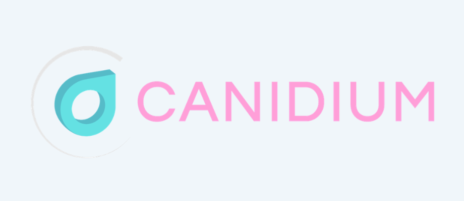
Don’t: Don't recolor the logo -
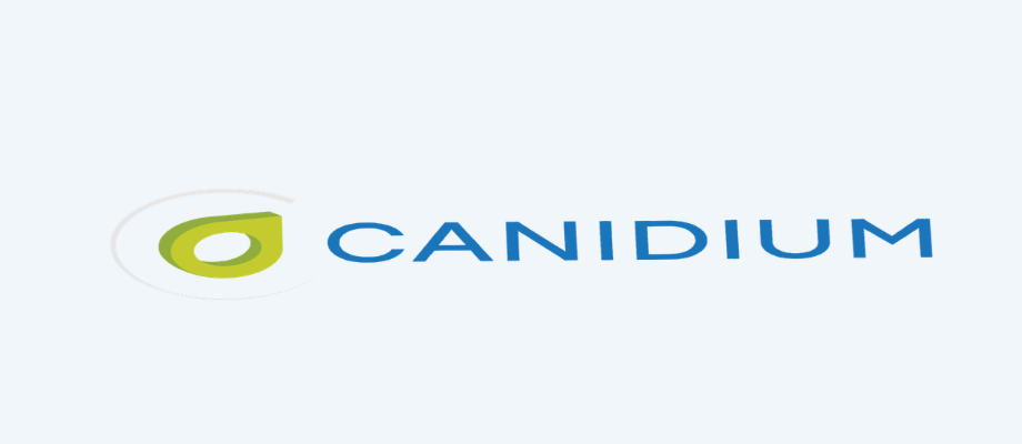
Don’t: Don't stretch the logo to fit alternate dimensions -
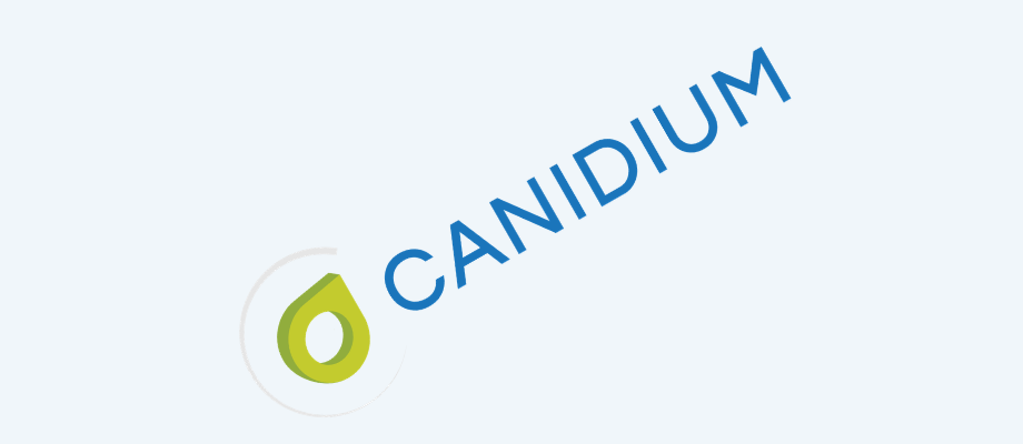
Don’t: Don't rotate or tilt the logo -
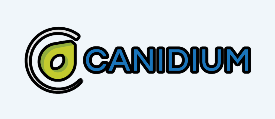
Don’t: Don't add effects like drop shadows, outlines, or glows -
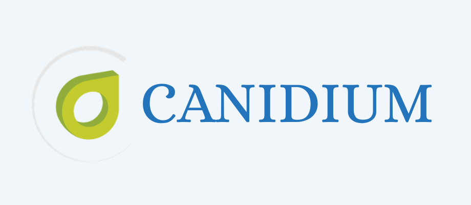
Don’t: Don't recreate the wordmark in another font -
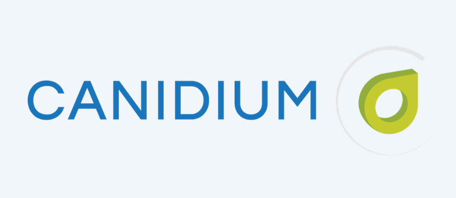
Don’t: Don't separate or rearrange the icon and wordmark
Brand Colors
Primary
-
Canidium Blue
#13527C
Go-to brand color
Text use: Yes
-
Deep Navy
#0E3C5C
Dark backgrounds, headers
Text use: Yes
-
Bright Blue
#2374BB
Links, headings, headers
Text use: Headings and links
-
Avocado Green
#94B03D
Low-key accent, logo
Text use: Emphasis on light backgrounds
Secondary
-
Sky Blue
#59AAD8
Graphics, charts, icons
Text use: No
-
Yellow Green
#C6CE2D
High-attention accent, logo
Text use: Emphasis on dark backgrounds
Neutral
-
White
#FFFFFF
Background
Text use: Default on dark backgrounds
-
Ice Blue
#F0F6FA
Primary background
Text use: No
-
Light Gray
#CCCCCC
Borders, dividers
Text use: No
-
Mid Gray
#828282
Monochrome logo
Text use: Subtle text only
-
Charcoal
#333333
Default body text
Text use: Yes (default)
-
Black
#000000
One-color print only
Text use: Print only
Click any swatch to copy its hex code.
Typography
Inter is Canidium’s typeface for everything, from headlines and slide decks to emails and social graphics. Its clean, open letterforms stay readable at any size, which keeps our materials clear and consistent wherever they appear.
Inter
ABCDEFGHIJKLMNOPQRSTUVWXYZ
abcdefghijklmnopqrstuvwxyz
0123456789 !?&@#$%()
- Light 300
- Regular 400
- Medium 500
- SemiBold 600
- Bold 700
-
Heading 1
Inter Bold (700) · 48px · Line height 1.15 · #13527C
Page titles and hero headlines
Everything you need to represent Canidium
-
Heading 2
Inter Bold (700) · 36px · Line height 1.2 · #13527C
Section titles
Integrated revenue optimization
-
Heading 3
Inter SemiBold (600) · 24px · Line height 1.3 · #333333
Subsections and card titles
Our approach to sales compensation
-
Subheading
Inter Medium (500) · 14px · All caps · Letter spacing 0.15em · #13527C
Eyebrows above headlines and section labels
Brand resources
-
Body copy
Inter Regular (400) · 16px · Line height 1.6 · #333333
Paragraphs, descriptions, and most running text
Canidium helps organizations design, implement, and optimize the sales performance management programs that drive revenue. Our consultants bring deep platform expertise to every engagement.
-
Caption
Inter Regular (400) · 13px · Line height 1.5 · #333333
Image captions, footnotes, and fine print
Caption text for images, charts, and footnotes
When Inter isn’t available, use Arial. This mostly applies to Outlook emails and documents shared with people who don’t have Inter installed. Inter is free to download, so install it on your computer for Word, PowerPoint, and Canva work.
Questions about our brand?
If you can’t find the file you need, want a second look at a design, or aren’t sure the guidelines cover your situation, our marketing team is happy to help.
Last updated October 8, 2026
Start a conversation with one of our experts.
Whether it’s a quick question or your sales management software is giving your team headaches, we’re here for you.